Like what you see? Share it, comment, ♡ it! =)

Completed 2013.
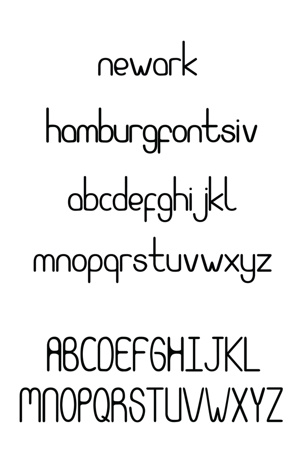
My favorite street in Newark is Halsey St. It represents the perfect combination of all that is Newark, the old and the new. Among the few streets that encompass it, you find cozy caffee shops, little boutiques, ethnic restaurants, bars, non-profits, art galleries, barber shops, crafts stores, apartment buildings, old department stores like the Hahne & Company, and new chains like soon to be Whole Foods.
What I particularly like is its eclectic nature and vitality. Whenever in this street you can be sure there is something to do. It has a familiar feeling, but it is constantly being renewed. For this reason, I used it as inspiration for my type design project. I started by looking into the calligraphic style of little local shops, old buildings and even the type of big corporate buildings under construction. I kept the curves of old style script, its fluidity; and mixed it with the sans serifs and more modern and playful types of new businesses.
I wanted the playfulness of the type’s shapes and relationships between forms and counterforms, to spark an interest in the street. I wanted this type to contribute in Newark’s reinvention, challenge old perceptions and urge the audience to form a new one.


